
Real estateLive, public site
Lake Yard
Zada Developments
An Arabic-first launch page for a commercial development in West Cairo, built around one job: turning visitors into qualified enquiries. It scored 95 for performance on mobile with zero layout shift.

Results
- 95
Performance score
Google PageSpeed Insights · mobile
- 100
Accessibility score
Also 100 for best practices and SEO
- 0
Cumulative Layout Shift
Google counts up to 0.1 as good
The challenge
Zada Developments was launching Lake Yard, a mixed-use development in West Cairo with administrative, medical and retail units. They needed a single launch page that would do one thing well: turn a visitor into a qualified enquiry. The audience reads Arabic first, so right-to-left had to be the primary design, not a mirrored afterthought, and the page had to stay fast on the phones most buyers use.
What mattered most
- 1Arabic-first, right-to-left design
- 2One goal: qualified enquiries
- 3Fast on the phones buyers use
What we built
01Arabic RTL
Right-to-left first, not mirrored later
Arabic is the primary direction, so the layout was built on logical properties from day one. Numerals, prices, the currency suffix and Latin brand names all sit correctly inside Arabic text, which is exactly what breaks when a left-to-right design is flipped at the end.
02Conversion
The shortest path to an enquiry
The enquiry form sits in the hero beside the pitch, WhatsApp is offered next to it for anyone who would rather not type, and every unit card carries its own button. Nobody hunts for how to get in touch, and nobody scrolls back up to do it.
03Forms
A form that asks for almost nothing
Name, mobile and an optional interest: three fields, one of them optional. The anti-spam check only loads once someone starts typing, so a genuine visitor never waits on a challenge before showing intent.
04Trust
Sold units left on the page
Instead of removing what has gone, sold units stay listed with the price struck through and a sold badge. It answers "is this moving?" without a line of persuasion, and makes the remaining availability credible.
05Performance
Fast enough that speed never cost a lead
Reserved space for every image, animation on transform and opacity only, and a short critical path. Google PageSpeed Insights scored it 95 for performance and 100 for accessibility, best practices and SEO, with zero layout shift.
The outcome
A launch page that puts the enquiry one tap away, reads naturally in Arabic and loads fast on a buyer's phone. A landing page cannot sell a building on its own, but it can stop losing the people who were already interested, and that is what this one was built to do.
Inside the project
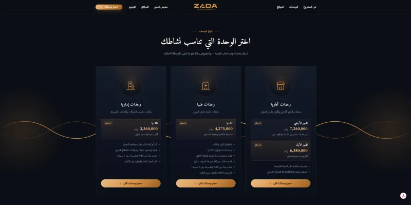
Unit types with areas, prices and payment terms, each with its own call to action so intent is captured where it forms. 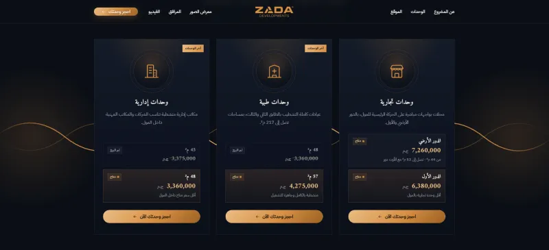
Sold units stay visible with the price struck through: honest about what is gone, and the scarcity is real. 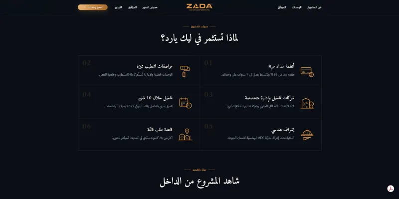
The investment case as six scannable reasons, for the visitor who reads nothing in full. 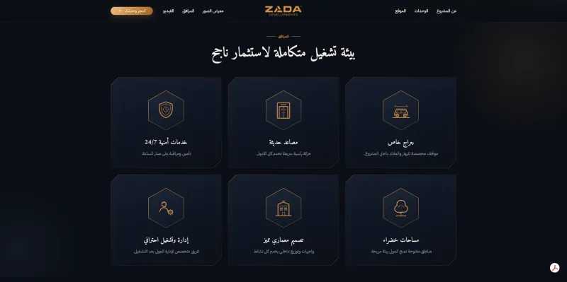
Amenities in a plain grid, the section buyers check last and expect to skim.


